
Door Signage is more than a label fixed beside an entrance. It helps people identify rooms, follow routines, and feel confident inside unfamiliar buildings. A clear sign can prevent hesitation outside a clinic, classroom, hotel room, or office. It can also reduce repeated questions at busy reception desks.
Wayfinding expert Paul Arthur described the sign as “the interface between the individual and the environment.” His observation explains why effective Door Signage must connect design with human behavior. Letter height, contrast, viewing distance, lighting, placement, and tactile details all influence whether people understand a message quickly. A sign should be readable from the corridor, not only attractive in a close-up photograph. It should also support visitors with different visual, physical, and language needs.
Small details matter.
This topic deserves a practical view. A polished plaque may still fail when glare covers the text, a door swings over the sign, or the wording feels unclear. I have seen how minor placement errors create awkward pauses and unnecessary backtracking. Not every building needs expensive technology or dramatic graphics. Often, consistent terminology and careful testing provide greater value. Still, design choices should be reviewed against current accessibility guidance and the building’s actual users. This article explores what Door Signage is, how it works, and why it remains important for safety, orientation, identity, and everyday experience. It will not solve every wayfinding problem, but it can help readers question signs that seem acceptable yet quietly confuse people.
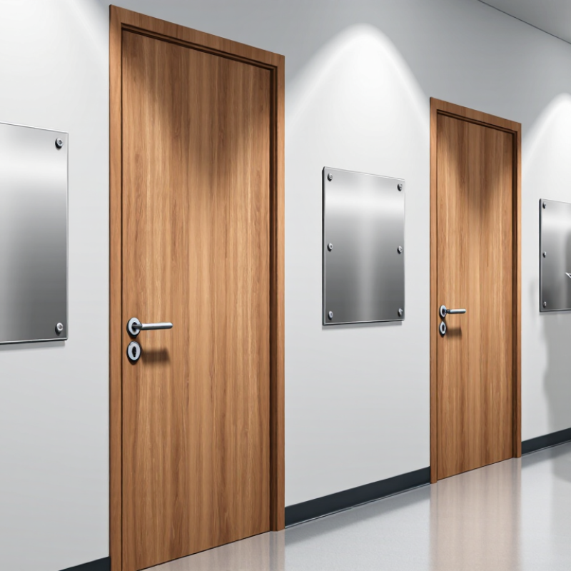
Door signage is visual information fixed beside or on a doorway. It identifies rooms, supports navigation, and communicates access conditions. A good sign answers one question quickly: “What is behind this door?”
Its core functions are practical. Room numbers help visitors locate appointments. Tactile lettering and Braille support people with visual disabilities. High contrast improves recognition in corridors, especially under uneven lighting. ISO 7001 recommends standardized public information symbols, helping people understand signs across language barriers.
The need is substantial. The World Health Organization’s World Report on Vision estimates that at least 2.2 billion people have near or distance vision impairment. Door signs cannot solve every accessibility problem. They can remove one unnecessary obstacle.
Safety is another function. The National Fire Protection Association reported 1,504,500 fires in the United States during 2023. Clear room identification can assist emergency communication and reduce avoidable confusion. It must work with evacuation systems, not replace them.
In practice, placement matters as much as wording. A sign hidden behind an open door fails. Glare, small text, and crowded walls create similar problems. I have seen technically correct signs remain difficult to read. Compliance is not the same as usability. Designers should test signs from a standing visitor’s view, then reconsider the result. Perfect placement is rare. Better feedback is essential.
What Is Door Signage and Why Is It Important?
Main Types of Door Signs and Their Common Uses
Door signage identifies rooms, guides visitors, and supports safer movement through buildings. Common types include room signs, directional signs, restroom signs, warning signs, and emergency signs. Room signs label offices, classrooms, and meeting spaces. Directional signs point toward elevators, exits, or reception areas. Restroom signs combine clear text with recognizable symbols. Warning signs may indicate restricted access, wet floors, or maintenance work.
Accessibility should shape every design choice. The World Health Organization reported in 2022 that about 1.3 billion people experience significant disability worldwide. In the United States, the CDC’s 2023 Disability and Health Data System reported that nearly one in four adults has a disability. These figures make readable lettering, strong contrast, tactile information, and suitable mounting heights practical necessities. Yet, a sign can follow technical guidance and still feel confusing. Real users may read it from different angles, under glare, or while carrying equipment.
Tips: Keep wording brief. Use high contrast. Place signs near eye level. Test them with actual users, not only designers. Avoid decorative fonts. Check whether symbols remain clear from several steps away. A hallway sign that looks attractive on screen may fail in dim lighting. That weakness deserves honest review before installation. Sources: WHO, Global Report on Health Equity for Persons with Disabilities, 2022; CDC, Disability and Health Data System, 2023.
| Sign Type | Typical Information | Common Uses | Why It Matters |
|---|---|---|---|
| Room Identification Signs | Room name, number, department, or occupant role | Offices, classrooms, meeting rooms, clinics, and hotel rooms | Helps visitors and staff locate the correct room quickly and reduces confusion. |
| Directional Signs | Arrows, destination names, floor numbers, or route information | Corridors, building entrances, campuses, hospitals, and public facilities | Supports wayfinding and helps people navigate unfamiliar spaces. |
| Accessibility Signs | Accessible-route details, tactile characters, Braille, or accessibility symbols | Accessible entrances, restrooms, elevators, and designated facilities | Provides information in formats that can assist people with different access needs. |
| Safety and Warning Signs | Hazards, required protective equipment, or safety instructions | Workshops, laboratories, utility rooms, and areas with restricted hazards | Communicates potential risks and precautions before someone enters. |
| Restricted-Access Signs | “Authorized Personnel Only,” access conditions, or entry instructions | Storage areas, staff rooms, equipment rooms, and secure work areas | Makes access limits clear and helps prevent unintended entry. |
| Privacy and Occupancy Signs | “In Use,” “Available,” “Do Not Disturb,” or privacy status | Restrooms, consultation rooms, interview rooms, and meeting spaces | Shows whether a space is occupied or whether interruptions should be avoided. |
| Emergency Information Signs | Emergency exit directions, assembly information, or emergency instructions | Exit doors, stairwells, corridors, and emergency equipment locations | Helps people identify important routes and instructions during an emergency. |
| Informational and Identification Labels | Door function, equipment details, operating instructions, or contact information | Service doors, electrical rooms, maintenance areas, and shared facilities | Provides practical details that support safe and efficient building operations. |
Effective door signage starts with a clear purpose. Visitors should understand what a door leads to or what action is expected within seconds. Use familiar wording, such as “Reception” or “Please Knock.” Keep the main message large and make it easy to distinguish from the background. A stylish sign that disappears in dim hallway light is not effective. Symbols can help people scan quickly, but only when they are clear and relevant.
Placement matters as much as wording. Mount signs near eye level and beside the handle when practical, so people can read them before opening the door. Check the view from both directions. An open door, coat rack, or glare can hide important text. Choose durable, easy-to-clean materials for busy spaces, and use consistent colors and type styles nearby. Consider accessibility features, such as raised characters or Braille, with qualified guidance. Small details add up. It is easy to overdesign a sign; simpler wording is often easier to use.
Tips: View the sign from several steps away under the hallway’s usual lighting. Ask someone unfamiliar with the space what they understand at a glance. If they hesitate, simplify the message or move the sign. Recheck it whenever the room’s use changes.
Effective door signage helps people identify rooms and navigate spaces. Strong text-to-background contrast is one important part of making signs easier to read.
How to read this chart: Each bar shows the contrast ratio for white text on a different background; higher values mean greater contrast. The dashed line marks the WCAG 2.2 AA benchmark of 4.5:1 for normal-sized text. Contrast ratios are calculated using the WCAG relative-luminance formula. This benchmark is a readability reference and does not replace applicable accessibility requirements for signage.
What Is Door Signage and Why Is It Important?
How Door Signage Supports Wayfinding and Accessibility
Door signage does more than identify a room. It helps people move through schools, offices, hospitals, and public buildings with less hesitation. Clear text, strong color contrast, and consistent placement make destinations easier to recognize. Raised lettering and Braille support people with visual impairments. A sign should also remain readable from a wheelchair height and under uneven lighting.
In my experience, visitors often miss signs when they are mounted too high or placed beside a busy doorway. Glare can make dark lettering appear faded. A design may look clear on a screen, yet fail in a real hallway. Accessibility specialists and facility teams should test signs during busy periods, not only in empty spaces. Local accessibility standards should guide the final details.
Tips: Use short room names, plain language, and large readable type. Keep signs near the latch side when possible. Add tactile information where required. Check visibility from standing and seated positions. Ask people with different access needs to review the layout. Their feedback may expose problems that designers overlook. Small adjustments can prevent confusion, although no single sign works perfectly for every building.
What Is Door Signage and Why Is It Important?
Door signs guide people, confirm locations, and reduce hesitation in unfamiliar buildings. Good design begins with the user, not the wall. The CDC’s Disability and Health Data System reports that about 27% of U.S. adults have a disability. That figure makes accessibility a practical design requirement. Use strong contrast, readable type, clear wording, and consistent placement. The 2010 ADA Standards require raised characters and Grade 2 Braille for many permanent room signs. They also specify character height based on viewing distance. These details affect real movement, not just appearance.
Installation needs the same care as design. Place signs beside the latch side when possible, keeping them within the required reach range. Avoid mounting them behind open doors, furniture, or decorative panels. A sign may look polished and still fail. ISO 7001, the international standard for public information symbols, supports familiar symbols that reduce language dependence. Use symbols only when their meaning is genuinely clear. Test the sign with people who have different visual, reading, and mobility needs. Their feedback often exposes problems that designers miss.
Material choice also matters. Matte surfaces limit glare under bright ceiling lights. Durable finishes withstand cleaning and frequent contact. Record the mounting height, text size, contrast ratio, and inspection date. This creates a reliable maintenance trail. Small errors remain possible, especially in older buildings. Review them during every renovation.
Room signs identify offices, classrooms, and meeting rooms. Directional signs point toward exits, elevators, or reception. Restroom, warning, and emergency signs serve specific needs.
Use brief wording, large lettering, and strong contrast. Familiar symbols can help when their meaning is clear. Fancy fonts may slow readers down.
Place it near eye level and beside the handle when practical. Keep it visible from both directions. Check that an open door or coat rack does not hide it.
Consider readable type, tactile characters, and Braille where appropriate. Keep signs within an accessible reach range. Ask people with different needs to test them.
Choose durable surfaces that are easy to clean. Matte finishes can reduce glare from ceiling lights. No finish stays perfect forever.
View it from several steps away under normal hallway lighting. Ask someone unfamiliar with the room what the sign means. If they hesitate, revise it.
Glare, low contrast, small text, and poor placement can hide the message. Furniture and decorative panels may block it too. We may overlook these problems during design.
Review them when a room’s use changes or during renovations. Record mounting height, text size, and inspection dates. Test them again.
Door Signage refers to the visual signs placed on or near doors to identify rooms, guide visitors, communicate instructions, and support a clear, organized environment. Common types include room identification signs, directional signs, restroom signs, office labels, safety notices, and accessibility signs. Each type serves a specific purpose, helping people quickly understand where they are and where they need to go.
Effective Door Signage should be easy to read, concise, durable, and visually consistent. Clear wording, appropriate contrast, readable typography, recognizable symbols, and suitable placement all improve communication. Door signs also support wayfinding by creating a logical path through buildings, while accessibility features such as tactile characters, Braille, and appropriate mounting heights help more people navigate independently. When designing and installing door signs, it is important to consider the building’s layout, viewing distance, lighting, materials, traffic flow, and the needs of different users. Well-planned Door Signage improves clarity, safety, accessibility, and the overall experience of visitors and staff.