
Why Choose Eye Catching Neon Business Signs?

Time:2026-11-16 Author:Mason
0%

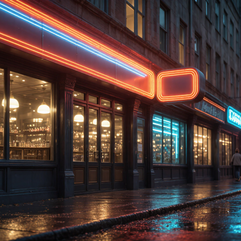
An illuminated storefront sign has only a few seconds to earn a passerby’s attention. After dusk, a clear neon message can stand out against dark glass, wet pavement, and crowded shopfronts. But brightness alone is not a strategy. The words, color, scale, and placement must work together—and suit the business behind them.

Paul Rand, the influential graphic designer known for shaping brand identities, wrote, “Design is the silent ambassador of your brand.” That idea applies to an Eye Catching Business Signneon Light: it communicates before staff can greet a customer. A warm glow may make a café feel inviting; crisp lettering can help a repair shop appear direct and dependable. Keep the message short. Check that it remains legible from the opposite sidewalk. Small details matter.

This outline explores why businesses choose neon signs, how thoughtful design supports recognition, and what owners should consider before installation. It will look at visibility, color, lettering, placement, upkeep, and the difference between memorable and merely loud. There is no magic formula. A sign that looks striking in a design mockup may feel overwhelming on a narrow street. That deserves a second look. Good signage balances attention with clarity, reflects the brand honestly, and gives people a simple reason to step inside.
Why Choose Eye Catching Neon Business Signs?

What Defines an Eye-Catching Neon Business Sign?

An eye-catching neon business sign attracts attention and communicates its message quickly. Its strongest feature is usually a clear focal point: a short business name, a useful service, or a simple symbol. Keep it readable. Check the lettering from across the street and from a pedestrian’s viewpoint. Thin strokes, tight spacing, and ornate scripts can blur together, especially on a busy window. High contrast helps, but brightness alone does not create clarity. A warm glow against dark brick feels different from cool light on glass, so assess colors in the actual setting.

A strong sign also fits its surroundings and viewing conditions. Consider nearby streetlights, reflections, the width of the storefront, and how far away customers will stand. Choose a size that remains legible without overwhelming the entrance. Before settling on a design, view a full-scale mock-up in daylight and after dark; small details can disappear once the sign is lit. There is a trade-off here: a vivid color may draw the eye but compete with other information. It is easy to overestimate how much detail people will notice. Test the message with someone unfamiliar with the business, then revise anything they cannot read at a glance.

How Neon Lighting Attracts Customer Attention

A bright sign can interrupt the visual rhythm of a busy street. Neon lighting stands out against brick, glass, and the muted colors of nearby storefronts. At dusk, a clear line of light can guide a passerby toward an entrance before they read the business name. Color matters. Warm tones can feel inviting, while cool hues may look crisp and modern; the best choice depends on the setting and audience.

Visibility comes from more than brightness. Large, simple lettering is easier to recognize from across a road than thin, tightly spaced text. Place the sign near eye level when possible, and check how it looks from the direction customers actually approach. Reflections in windows, competing headlights, and nearby illuminated displays can all weaken its impact. A quick daytime and nighttime viewing test can reveal problems that are easy to miss from inside the shop.

It is tempting to make every word glow. That can backfire. Too many colors or decorative shapes may make the message harder to read, especially at a glance. A focused design, with one clear offer or business name, often communicates faster. Neon lighting may attract attention, but it cannot guarantee a visit; the sign still needs to match the storefront, remain legible, and set an honest expectation of what customers will find inside.

How Neon Signs Strengthen Visibility and Brand Identity

Neon signs do more than glow after dark. Their saturated color, clean lettering, and steady illumination help a storefront stand out among traffic, glass, and competing displays. They also signal personality: warm amber can feel welcoming, while cool blue may suggest precision. Keep the message readable from the pavement. Brightness without clarity is just brightness.

The commercial value is measurable, though not guaranteed. A 2012 U.S. consumer survey on storefront signage found that 76% of respondents had entered a business they had never visited because its sign caught their attention. The survey also reported that 68% had bought a product or service after noticing an appealing sign. These results suggest signage can support discovery and purchasing decisions; they do not prove neon alone causes sales. Placement, upkeep, and a consistent visual style still matter. A flickering tube can weaken trust, even when its color is memorable.

Tips: Match the neon color and lettering to your visual identity, then check readability from across the street. Use one short message. Test for glare at night, and view the sign in daylight too. An extra line may seem useful, but it can make the main idea harder to remember.

Where Businesses Commonly Use Neon Signs

Neon signs often appear in storefront windows, where pedestrians can spot a clear word or simple icon from the sidewalk. A bakery might use warm-colored lettering near its entrance, while a salon could place a small sign behind the reception desk. These locations give customers an immediate visual cue without filling the space with extra décor. Small details matter. Keep the message brief and choose a size that remains readable from the usual viewing distance.

Restaurants, cafés, and bars use neon to add atmosphere around counters, seating areas, or feature walls. A soft glow behind a menu board can draw attention, but it should not compete with the menu itself. In gyms and studios, signs often sit near mirrors or photo areas; reflections can make bright tubing feel harsher than expected. Not every wall works. Check sightlines, daylight, nearby lighting, and power access before choosing a spot.

Hotels, event venues, and creative offices may use neon in lobbies, meeting areas, or branded photo corners. For outdoor storefronts, confirm that the sign and its electrical components are rated for the conditions where they will be installed. Ask a qualified sign professional about mounting, wiring, and dimming options. Bright is not always better. A sign that looks striking in a dim showroom may feel overpowering at noon, so test the color and brightness in the actual space when possible.

Why Choose Eye Catching Neon Business Signs? - Where Businesses Commonly Use Neon Signs
Business Type Common Placement Typical Sign Content Practical Purpose Planning Consideration
Restaurants and cafés Front windows, interior feature walls, counters, and dining areas “Open,” menu highlights, short greetings, or decorative graphics Make the entrance easier to notice and add a distinctive visual feature inside the venue Position signs so they do not obstruct window visibility, menus, or customer pathways
Bars and lounges Behind the bar, near entrances, and on interior walls Short phrases, directional cues, or atmospheric artwork Create a recognizable focal point and contribute to the room’s lighting and decor Consider brightness and placement to avoid distracting customers or staff
Retail stores and boutiques Storefront windows, entry areas, and display walls “Open,” “Sale,” or brief category and welcome messages Help communicate store status or draw attention to a display from nearby areas Keep essential merchandise and window displays visible; check local rules for exterior-facing signs
Hotels and lodging Reception areas, lounges, event spaces, and selected exterior locations Wayfinding words, welcome messages, or decorative symbols Support guest orientation and add visual character to shared spaces Use clear wording and place directional signs where guests can easily see them
Salons and personal-care businesses Street-facing windows, reception desks, and styling areas Business-category labels, short service messages, or decorative motifs Make the premises easier to identify and reinforce the intended interior atmosphere Choose a readable design that remains clear against the window or wall background
Entertainment and event venues Ticket areas, stages, photo backdrops, and interior feature walls Venue directions, event headings, or photo-friendly graphics Provide a visible focal point and help guests identify key areas Securely mount the sign and route power cables away from public walkways
Offices and creative studios Reception areas, meeting rooms, and shared workspaces Room labels, short welcome messages, or decorative designs Add visual interest to visitor-facing areas and help identify selected spaces Use lighting that suits the work environment and does not create distracting glare

What to Consider When Choosing a Neon Sign

Choosing a neon sign starts with the place it must work, not just its color. Measure the wall and view the space from the distance customers will approach. A sign that looks bold on a screen may feel cramped above a narrow doorway. Check it at night. Streetlights, windows, and glossy surfaces can wash out thin lettering. Very bright light may distract rather than guide. Choose wording that stays readable at a glance; long phrases often lose impact across a parking area. Small details matter.

Ask whether glass neon or LED-style neon suits the setting. Glass can offer a distinctive glow. LED versions are often lighter and simpler to mount, but check the product’s care and weather ratings. For outdoor use, confirm its protection against moisture and temperature changes. Review the mounting plan and cable route with the installer. Indoors, consider nearby materials, heat, and access to a suitable outlet. Request a scale drawing and, if possible, a sample of the actual color. Color can shift under different lighting. Plans sometimes look convincing on paper and awkward once fitted. Leave room for adjustment, and ask how repairs or replacement sections will be handled before ordering.

FAQS

What makes a neon business sign easy to notice?

Use a short name, service, or symbol as the clear focal point. Keep it readable.

How can I check whether the lettering is readable?

View it from across the street and from the sidewalk. Thin strokes and tight spacing can blur together.

Should I choose the brightest color?

Not necessarily. Brightness without clarity is just brightness. Compare the glow with nearby lights and reflections.

How can I tell whether a sign suits my storefront?

Check its size against the entrance and surrounding windows. A warm glow may stand out on dark brick; cool light looks different on glass.

Why should I test a full-scale mock-up?

Small details may disappear when the sign is lit. View the mock-up in daylight and after dark.

Can neon signage help attract new customers?

A 2012 U.S. survey found that 76% of respondents had entered an unfamiliar business after noticing its sign. That does not prove neon alone caused the visit.

How much text should the sign include?

Keep it to one short message. An extra line may seem helpful, but it can make the main idea harder to remember.

How can I check whether the design works for other people?

Ask someone unfamiliar with the business to read it at a glance. I might still favor vivid colors too much. That’s worth reconsidering.

Conclusion

An Eye Catching Business Signneon Light combines vivid color, clear lettering, and thoughtful design to make a business easy to notice. Neon-style lighting draws attention through its brightness and contrast, helping a sign stand out in busy streets, storefronts, and indoor spaces. When its colors, shapes, and message reflect a business’s character, the sign can also build recognition and create a memorable impression for customers.

Neon signs can be used in windows, entrances, reception areas, restaurants, shops, and event spaces. Choosing the right sign means considering its size, placement, visibility in different lighting conditions, color palette, wording, and energy needs. A well-planned design balances visual impact with readability, so customers can quickly understand the message without the sign overwhelming its surroundings.

Mason

Mason

Mason is a seasoned marketing professional with a deep expertise in the company's offerings and a passion for driving brand awareness. With a strong background in digital marketing strategies, he has an innate ability to connect with diverse audiences and effectively communicate product benefits.......