
A Neon Sign can turn an ordinary storefront into a place people notice after dusk. Imagine warm red lettering reflected on wet pavement, or a cool blue glow framing a quiet café entrance. That visual moment can help customers recognize a business and remember its name. It is not magic. The message, placement, and readability still matter.
Graphic-design pioneer Paul Rand wrote, “Design is the silent ambassador of your brand.” His words offer a useful lens for choosing a Neon Sign: its color, lettering, and light communicate before a customer walks inside. A sign should fit the business, not simply look striking in a photograph. Consider viewing distance, surrounding light, installation needs, and how the sign will appear during daylight. A skilled sign maker can help assess those details and explain material and maintenance choices. Keep the message brief. Keep it clear.
There are trade-offs. A custom design may require more planning and investment than a standard display, and a bright sign cannot fix an unclear offer or poor service. That is easy to forget. Before ordering, compare sketches with the actual storefront and ask how the sign will be mounted and maintained. The right choice can give a business a distinctive, welcoming presence—without asking the light to do all the work.
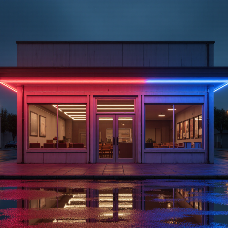
A neon business sign is more than bright lettering. It is a shaped light source that helps people notice a shop, café, or studio. Traditional neon uses sealed glass tubes filled with gas. A specialist heats and bends each tube to form letters or outlines. The result can have a smooth glow and distinctive color. But glass can break, and repairs need skilled hands. That matters.
LED flex signs use small diodes inside a flexible, diffusing casing. They can trace curves and narrow lettering, often with lower-voltage components. Their light may look more uniform, but it does not always match the depth of glass neon. The word “neon” is often used for both styles, so ask what materials and lighting the sign actually uses. I would not choose by brightness alone; daylight, viewing distance, and nearby reflections change how a sign reads. There is no perfect option.
Tips: View a sample in the intended lighting, and check letters from across the street. Ask about cleaning, power needs, installation, and repair access. Keep the message short. A beautiful sign can still be hard to read.
A 2012 survey reported that 76% of people had entered a store they had never visited because of its sign. That figure points to a simple advantage: visibility can turn passing attention into a first visit. A neon sign works after dark, in rain, and along busy streets where small lettering can disappear. Its glow can make a doorway easier to spot from across a parking lot. Small details matter. Color, contrast, and readable wording help people understand what a business offers before they reach the door. If the message is vague, the glow may attract eyes but not customers. Measure the viewing distance, check the sign against the building, and keep the wording brief.
Still, the survey figure should be read carefully. It describes reported behavior, not a promise that every illuminated sign will bring new visitors. Location, audience, and storefront design all shape results. A sign can also feel too bright or out of character. That part is easy to overlook.
A 2012 survey reported that 68% of respondents had bought a product or service after a sign caught their eye. That figure points to a useful role for storefront signage: it can turn passing attention into a reason to step inside. It does not mean a neon sign guarantees sales. The survey is a snapshot, not a promise for every shop, street, or season.
A neon sign can stand out at dusk, when window displays lose contrast and passing customers have only seconds to look. Choose lettering that stays readable from the sidewalk, and keep the message brief. A warm glow around a clear “Open” sign may work better than several competing colors and lines of text. That matters. Brightness alone cannot explain what a business offers.
Not every window wins. Placement, nearby lighting, and the audience all affect whether people notice a sign. Track simple results: ask new customers what brought them in, or compare visits before and after installation. If the sign draws eyes but few people enter, rethink its wording, position, or connection to the products inside. A small shop might test one change at a time, though that takes patience.
68% of surveyed consumers reported buying a product or service after a sign caught their eye.
Source: 2012 consumer survey statistic. The chart presents the reported percentage.
Neon gives a storefront a visual signature that can work after daylight fades. A coral loop around a doorway, for example, can be easier to recall than a plain rectangle. Color sets mood; shape makes the outline distinctive. Keep the palette focused. Too many hues can blur the message, especially across a busy street. A Sign Research Foundation report, The Economic Value of On-Premise Signage, estimated that adding an on-premise sign could increase sales by about 4.75% for businesses without one. That is an estimate, not a guarantee. Placement and upkeep still matter.
Visibility depends on more than brightness. Use strong contrast between the tubing and its backing, and make the lettering readable at the distance customers approach from. A short name or simple symbol usually survives a quick glance better than a long line of text. Test the design from the sidewalk and across the road; a mock-up on a screen can make letters look larger than they feel outdoors. Neon can attract attention, but glare, reflections, or a crowded window can weaken its effect. Color carries memory. Give it room. A slightly uneven glow may even feel more human, though it can also look like a maintenance problem.
| Design Dimension | What to Consider | How It Supports Recognition | Practical Check |
|---|---|---|---|
| Color | Choose a limited palette with clear contrast between the lettering, sign background, and surroundings. | Consistent, distinct color choices can help people associate a visual appearance with a business over repeated encounters. | View the sign in daylight and after dark; check that the lettering remains distinguishable from its background. |
| Shape and lettering | Use simple forms and lettering that can be read at the intended viewing distance. | A recognizable outline or concise wordmark is easier to identify quickly than a crowded design with many small details. | Preview the design at its actual installation size and from the expected pedestrian or road approach. |
| Visibility and placement | Consider viewing angle, nearby obstructions, sign height, and the typical approach direction. | A sign that is visible from relevant routes gives people more opportunities to notice and remember it. | Inspect sightlines from public approaches and check for trees, street furniture, or other signs that may block the view. |
| Contrast and legibility | Keep sufficient visual separation between strokes, letters, and surrounding light sources. | Clear contrast helps distinguish the sign’s message, particularly when viewed briefly or from farther away. | Check that letters do not blur together when illuminated and that the message is readable without stopping. |
| Consistency across touchpoints | Repeat the same core colors, lettering style, and key visual shape on signs and other customer-facing materials. | Repeated visual cues make it easier for customers to connect a physical location with other communications. | Compare the sign with menus, printed materials, and digital graphics for consistent colors and design elements. |
| Viewing conditions | Account for ambient light, reflections, weather exposure, and nighttime surroundings. | Testing under real conditions helps ensure the sign remains noticeable without relying on a studio mock-up. | Review the installation during both bright and dim conditions, and from the main viewing angles. |
| Maintenance and operation | Plan for inspection, cleaning, electrical safety, and repairs appropriate to the sign’s construction and location. | A sign that is kept clean and functioning presents its intended colors and shapes more consistently. | Follow the manufacturer’s care instructions and have electrical work handled by qualified professionals. |
A neon sign should fit its location as well as its look. For traditional glass neon, inspect the tube bends, mounting points, wiring, and transformer enclosure before installation. Glass can break, and the transformer handles high voltage. Ask an electrician to check the sign’s listing, grounding, and suitability for damp or outdoor spaces. Check the transformer.
Durability depends on construction and exposure. A sign above a sunlit shop window faces different conditions from one inside a dry café. Ask the maker for maintenance guidance, expected service life, and warranty terms; these vary by design. Energy use also deserves a measured answer. Record the sign’s rated wattage and estimated daily operating hours.
The U.S. Department of Energy reports that LEDs use up to 90% less energy than incandescent lighting and can last up to 25 times longer. That is not a direct comparison with glass neon, but it shows why an LED alternative may merit consideration.
Local requirements can affect placement, wiring, permits, and brightness. In the United States, the National Electrical Code’s Article 600 addresses electric signs, but local authorities decide which code version applies. Confirm requirements with your building department before ordering.
Measure twice. A missed permit or unsuitable weather rating can turn a striking storefront feature into an expensive adjustment.
It is a shaped light source for a shop, café, or studio. It can use bent glass tubes or flexible LED lighting.
Glass tubes are heated and bent by a specialist. They can create a distinctive glow, but glass may break. LED flex is more flexible and often gives a more even light. It may not have the same depth.
Ask what materials and lighting it uses. The word “neon” can describe either style. Check a sample, too.
Strong contrast, clear lettering, and thoughtful placement help. Test it from the sidewalk and across the street. A screen mock-up can be misleading.
A focused palette is usually easier to read than many competing hues. Try a coral outline against a dark backing, then check it in daylight and after dark.
A short name or simple symbol is easier to catch at a glance. Keep it short. Long lettering can blur across a busy street.
Ask about power needs, cleaning, repair access, and installation. View the sign in its intended lighting, and check for reflections from nearby windows.
Not always. Glare, reflections, and a crowded window can reduce readability. I might choose brightness too quickly; distance and contrast deserve a real test.
It can feel more handmade, but it may also signal a maintenance issue. There is no perfect option. Check whether the light stays clear and readable.
A Neon Sign can help a business stand out by combining bright illumination with distinctive color, shape, and lettering. Traditional signs use illuminated glass tubes, while modern LED flex offers another way to create a similar glowing effect. Because signs are often seen before customers enter a business, an eye-catching design can encourage visits and make a brand easier to recognize. A 2012 survey reported that 76% of respondents had visited a store they had never entered because of its sign, and 68% had bought a product or service after a sign caught their attention.
Choosing the right Neon Sign means considering more than appearance. Compare glass and LED options for durability, energy use, maintenance, and suitability for the intended location. Check that the sign is installed safely and that its brightness, placement, and construction meet applicable local requirements. A well-planned sign can support visibility and recognition while fitting the business’s practical needs.